The Inside
Discover your brand’s reach, audience, market, purpose, and beliefs. How we develop brands is grounded in where that brand will live and who it will interact with. If you already have some of this information, we can leverage that too.
We gather and develop this foundation with:
- Brand awareness studies
- Audience insights
- Market research
- Stakeholder interview
- Strategy & tactics
- Positioning
- Brand pillars
The Outside
Define the brand with a strategic identity.
If you have a brand that doesn’t properly represent your business, or you have no brand at all yet, these are things we can help you with:
- Voice and tone
- Expressions (tagline, key marketing points)
- Visual identity
- Campaign concepts
- Copywriting
- Brand partnership approach
- Content strategy
Ongoing Support
If you’re the Founder of a small business, or leading a team at a larger company, we offer select clients:
- Brainstorms & workshops
- Strategy advisement
- Oversight of Brand implementations
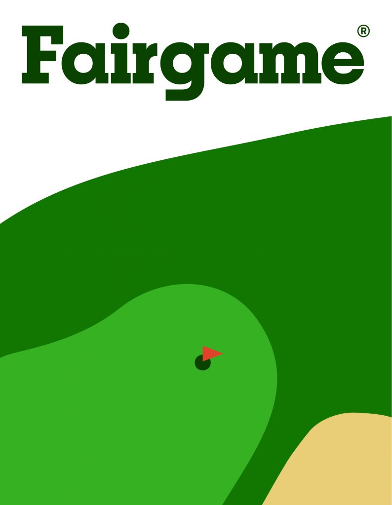
Sequel—Reimagining the Future of Tampons
- Positioning
- Brand Strategy
- Visual Identity
- Packaging
- Voice and Tone
- Expressions
- Website Design
- Copywriting
- Photography
- Visit Link
- Positioning
- Brand Strategy
- Visual Identity
- Packaging
- Voice and Tone
- Expressions
- Website Design
- Copywriting
- Photography
- Visit Link
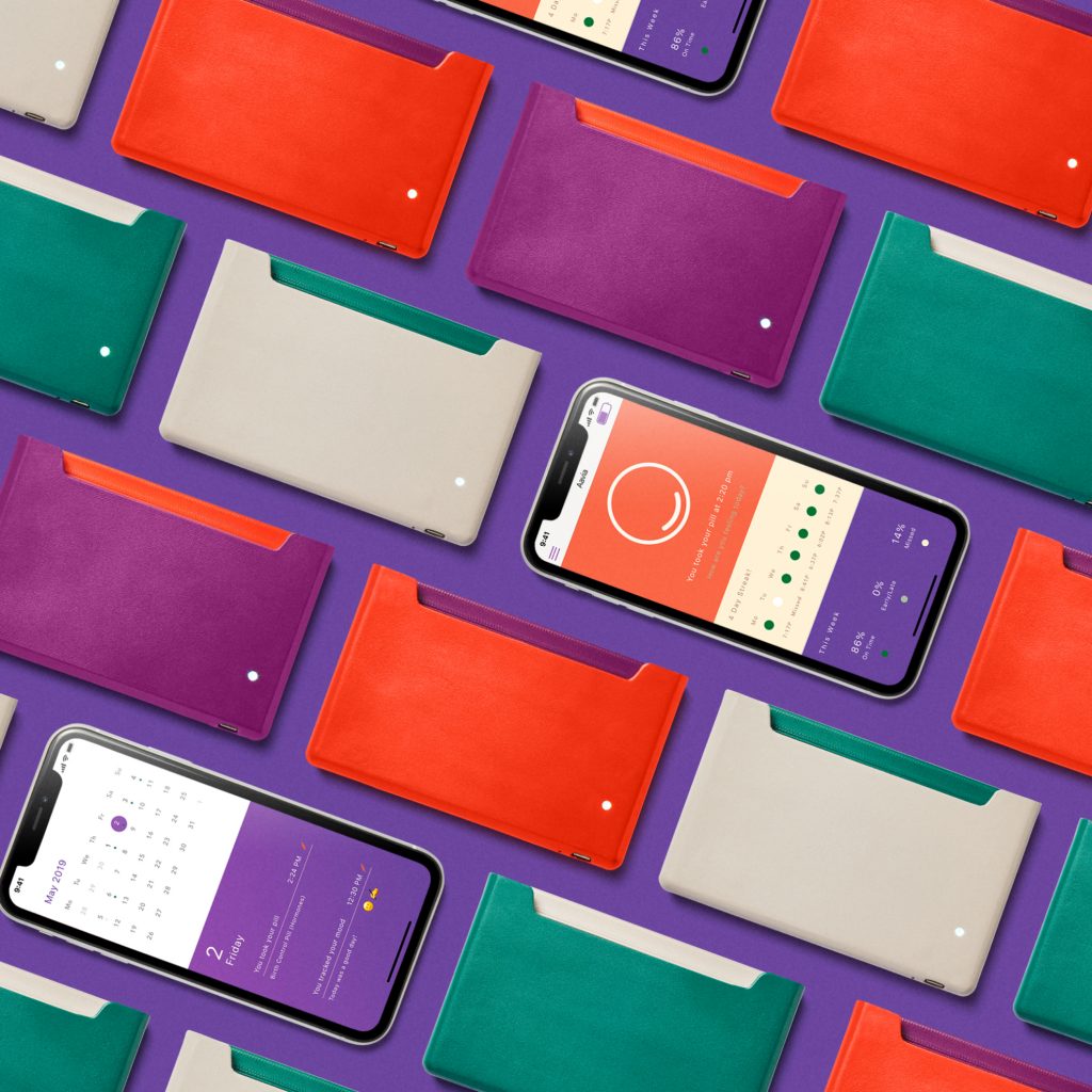
When we met Sequel’s co-founders, they already had a logo, color palette, and website. The problem was that despite having an understanding of how the brand should generally look, they didn’t understand who the brand was and why. As a young company without a foundation to its brand, they had nothing to base brand decisions on.
Our wordmark—confident and fluid.
As they entered into a saturated market, we knew that Sequel required a clear positioning that would set the brand apart and reinforce its unique value. They also needed a strategy that would pave the way for achieving that positioning (and make all decisions moving forward much, much easier).
Complacent Consumers
We learned that when it comes to tampons, people fall into one of two categories:
A) I’m fine with my current tampon, or,
B) I can’t really imagine how my tampon could get better
This is one of several critical findings from our research that drove the positioning of the Sequel brand. We knew that not only did Sequel need to reengineer the tampon, but they needed to reengineer what it means to be a tampon user.
Forecasting a Positive Outlook
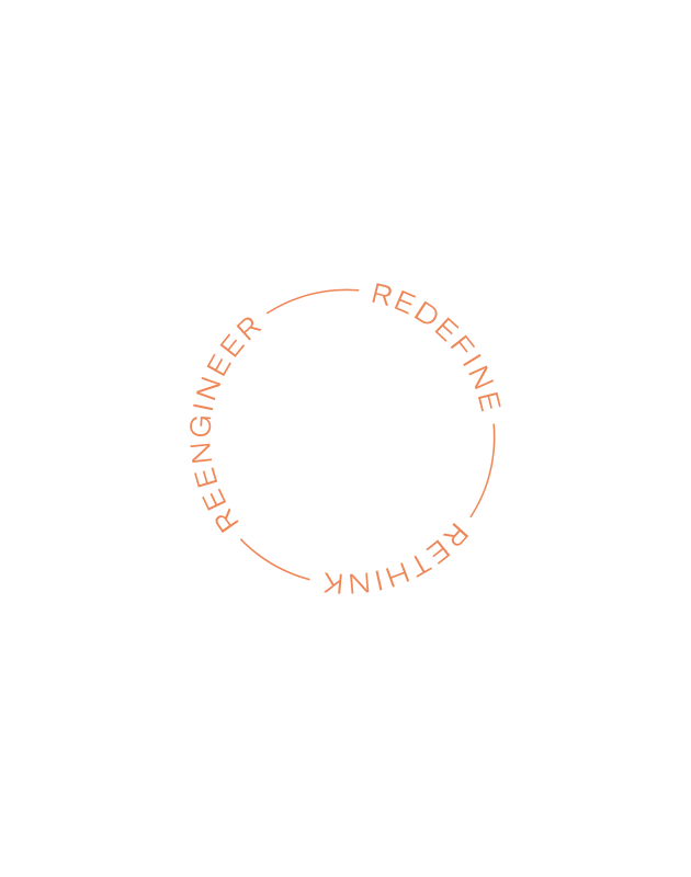
The tagline we developed for the brand—Rethink, Reengineer, Redefine—set the tone for the new identity. This tone is forecasting a positive outlook for any product Sequel touches. They’re applying their engineering degrees to something that people have grown apathetic toward and in turn, redefining our relationship with our essential products.
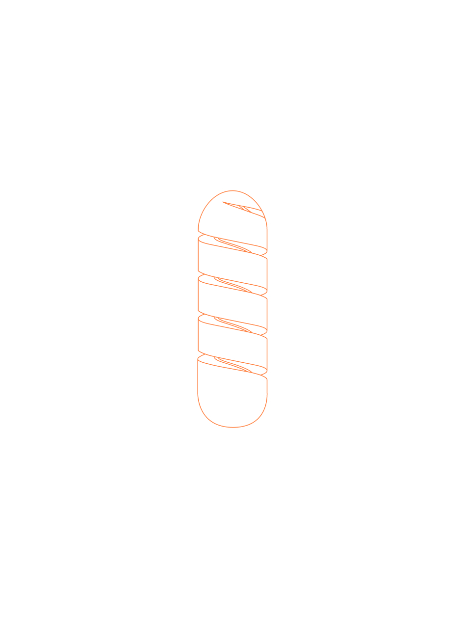
The Sequel tampon introduces a simple change, one you might not even notice, that greatly changes the impact of your tampon. We wanted the identity to have the same impact and restraint, only making the noise it needs to in order to do the job.
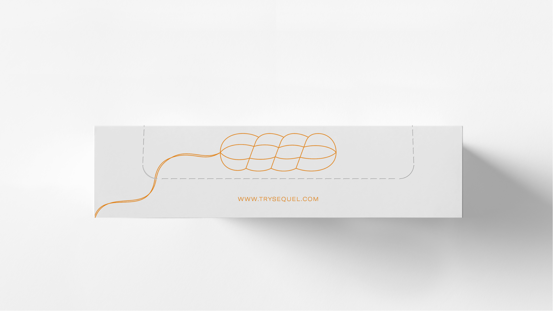
First, a single color: clementine. The tampon shelves are loud, so the Sequel identity is pointedly not. Then, clean, geometric lines that serve as both a tool for communicating important information with ease, as well as a familiar pattern that builds easier recognition.
Brand Applications
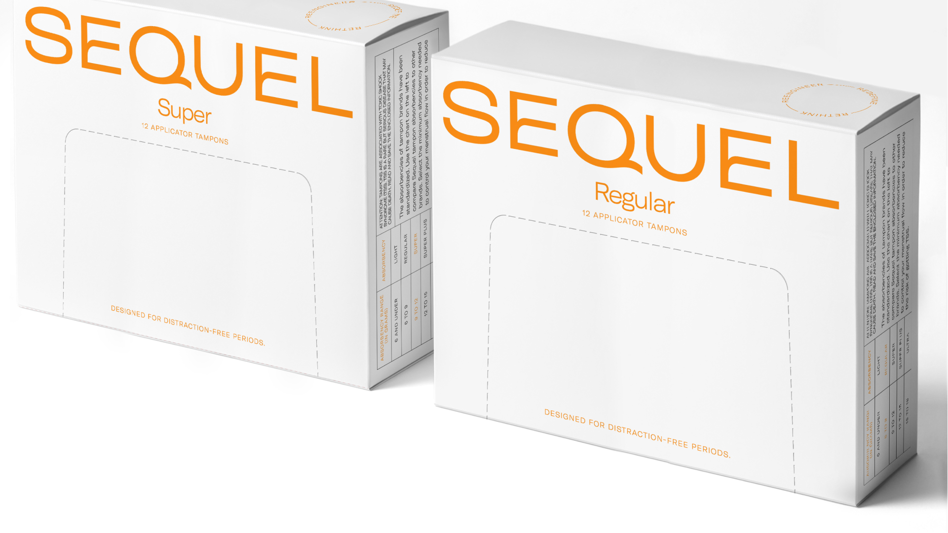
Minimal packaging to stand out on noisy tampon shelves
Brand details
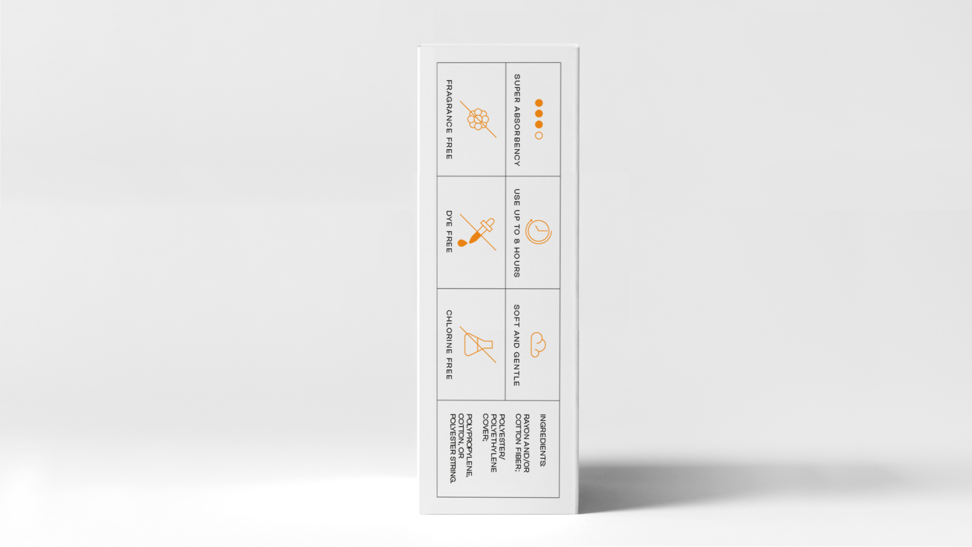
Easy-to-digest information
A Brand That Moves
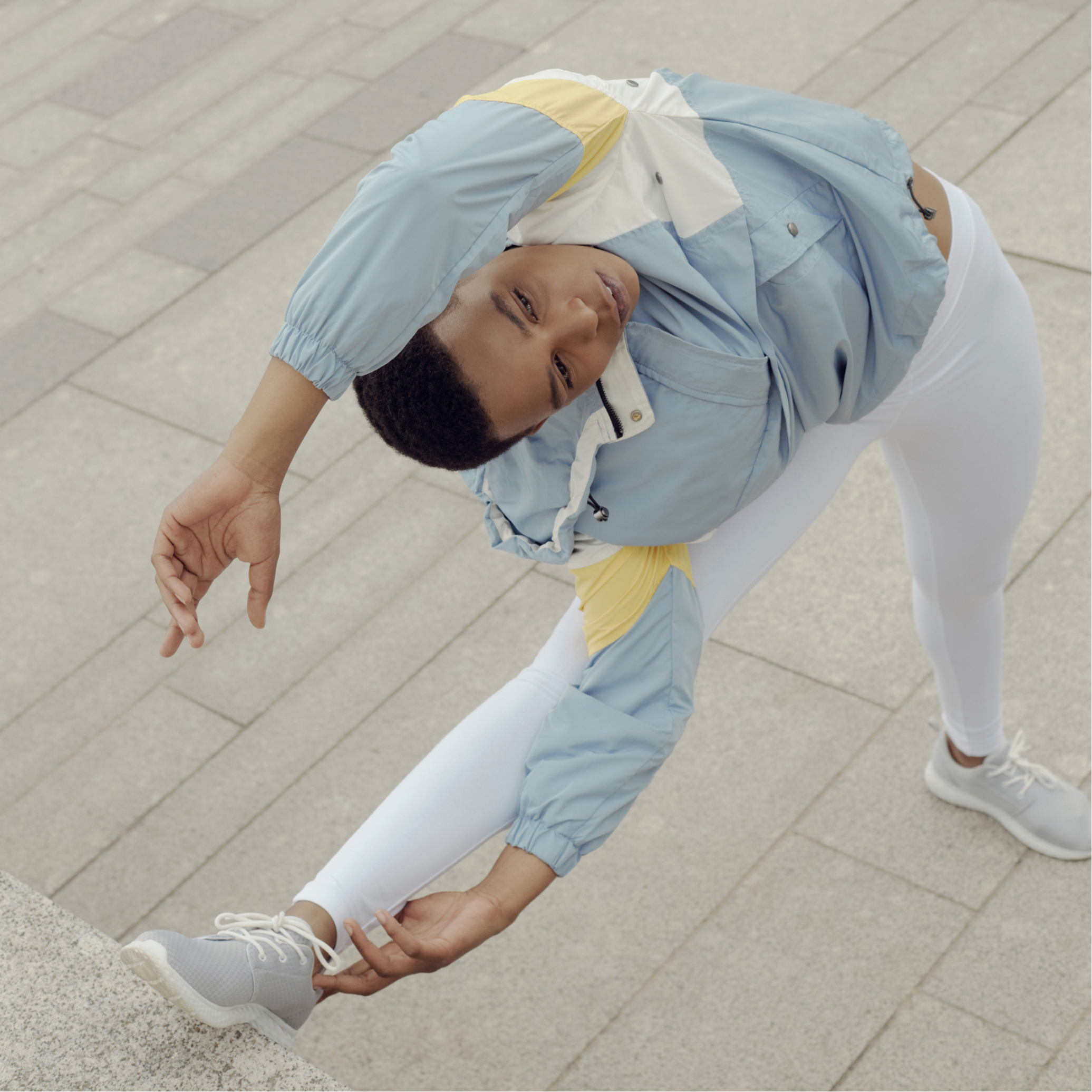
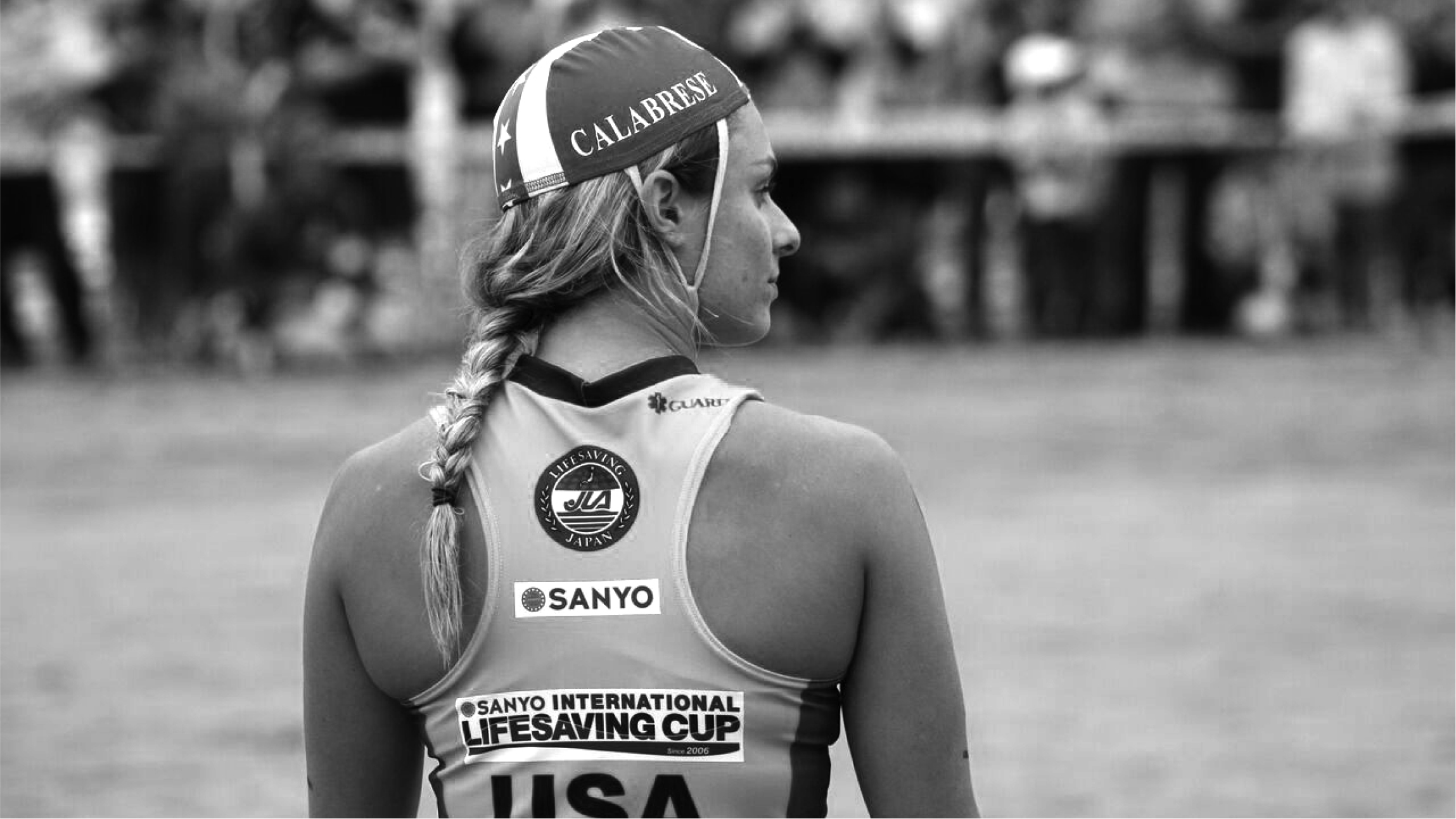
As collegiate athletes, the founders were moved to rethink the tampon because they couldn’t find any they trusted themselves when out on the field. They continued to move the needle when they reengineered the decades-old design of the tampon. And their promise as a brand is to never stop moving when it comes to rethinking, reengineering, and redefining life’s daily essentials.
Wordmark Details
With movement as an integral theme, the logo at the heart of the visual identity includes details on the E and Q that allude to movement, while the sans serif and wide letters speak to the active and bold parts of the brand identity.
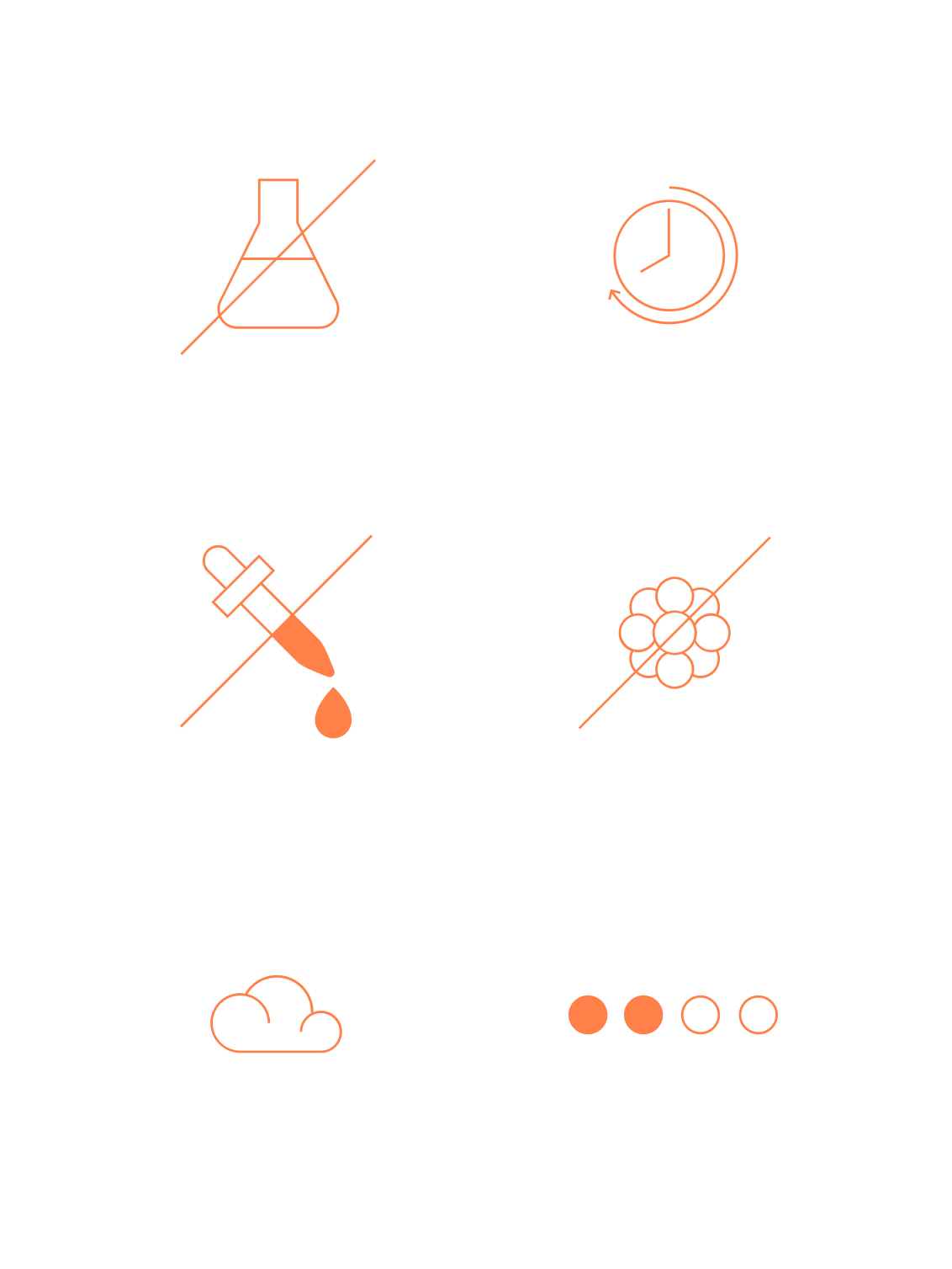
Iconography System
Daily essentials shouldn’t take unnecessary brain power. Our custom set of icons were designed to be used on the website and packaging so that Sequel could divide important information into bite sized bits.
We have a unique product, and it required a lot of attention to detail and meticulous research for the Martha team to make sure that all of our assets were up to a medical device standard and also beautiful to the end user. They are so patient with the trial and tribulations of an early stage startup, and could not recommend them more highly for those in the earliest stages of their work!